aapl Implied Vol
AAPL Historic Implied Volatility
Last time I tried looking at options with a toy model:
I modeled a random walk and placed calls/puts on it,
then calculated some of the Greeks using Black-Scholes.
But what if we tried going in the opposite direction, beginning instead with real market data and using end-of-day prices to calculate implied volatility for AAPL calls?
Let's start!
But what if we tried going in the opposite direction, beginning instead with real market data and using end-of-day prices to calculate implied volatility for AAPL calls?
Let's start!
I. Black-Scholes
How do we compare options with different spots, strikes, and times to expiration?
Fundamentally, we need something to map from all these factors to the value of the option, and vice-versa. If we make a few assumptions so we can use the Black-Scholes model, we have a way.
Because most of the attributes of an option are just facts that we can look up (spot, strike, risk-free rate, time to expiry), we can treat Black-Scholes as a function of volatility, that outputs price. This is exactly what we were looking for!
Unfortunately, we don't know what the true volatility is, because we don't know the behavior of the security in the future. (If we did, we would be billionaires.)
But if we reverse the function, we can solve for volatility given the market price. In this sense, we are looking at what the market thinks the future volatility will be. We can even graph implied volatility with other factors and make a volatility surface, to find out which options in the market are expensive and which are cheap.
So the first step of this project was coding an implementation of Black-Scholes that could solve for volatility, given price. Black-Scholes can't be solved analytically, so I had to find a root-finding algorithm to get an approximate solution: I ended up settling on the Newton-Raphson method, which generally converged to the implied volatility of an option in just a handful of iterations.
After testing my Black-Scholes implementation with test data, it was time to start looking at market data:
II. The Data
My first attempt was downloading data from the library, a time-series of AAPL calls expiring 2020-12-11, with $60 strike. This was a 1.5GB zip. Which became a 30GB CSV when I uncompressed it. Which my laptop (with ~1GB RAM) was never going to run.
When I went through just the first 0.4GB (it was 292 columns and more than a million rows), I discovered to my chagrin that the dataset was sparse. After cleaning it up with Pandas, I ended up with only three columns, a few hundred rows, and only a few kilobytes left.
After that I downloaded a CSV with 4-Week T-Bill rates from the Federal Reserve, to get numbers for the risk-free rate. Then IEX API calls gave me prices and dividends for the underlying.
But when I decided to test my Black-Scholes functions on the data, it just wouldn't work. The prices were somehow too low, and no amount of volatility would let the model match the observed price.
That was when I decided to graph the data:
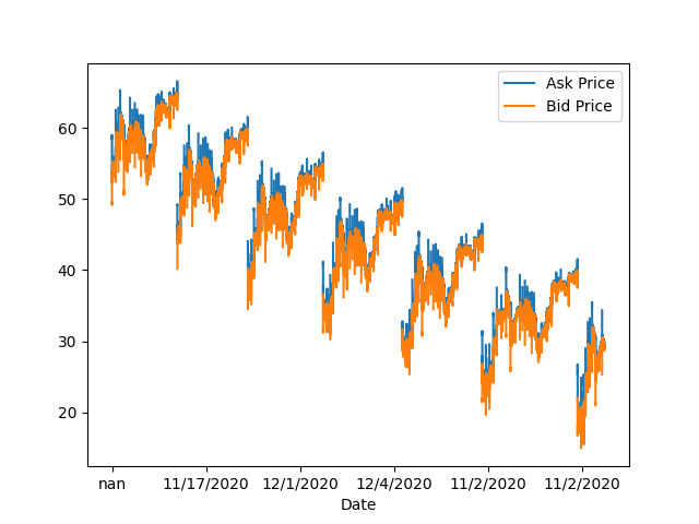
...So, that looked fishy. I knew I needed a new dataset.
Luckily, it was around Christmas. So for Christmas I bought myself a CBOE 3-month options dataset, which is probably the weirdest present I've ever gotten.
It had prices for both options and the underlying between 2018-09-04 and 2018-11-30, with dates and expirations. (Because the CBOE dataset included prices on the underlying, I no longer had to make IEX calls.)
The Pandas part was a bit more complicated, since I had to deal with different strikes and expirations now. To track each option, I had to index the dataset with tuples containing quote date, expiration, strike, and call/put type. Also tricky was converting between different conventions for date and time.
For the terms, I used (Trading Days)/252, and for the prices, I used the midpoints between the bids and asks. Dividends were converted from dollars per share, to annual yield.
So, let's take a look at the data!
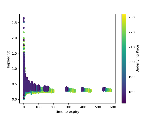
First, we can filter the data down to ~500 observations, by only looking at at-the-money calls. Let's graph implied volatility:
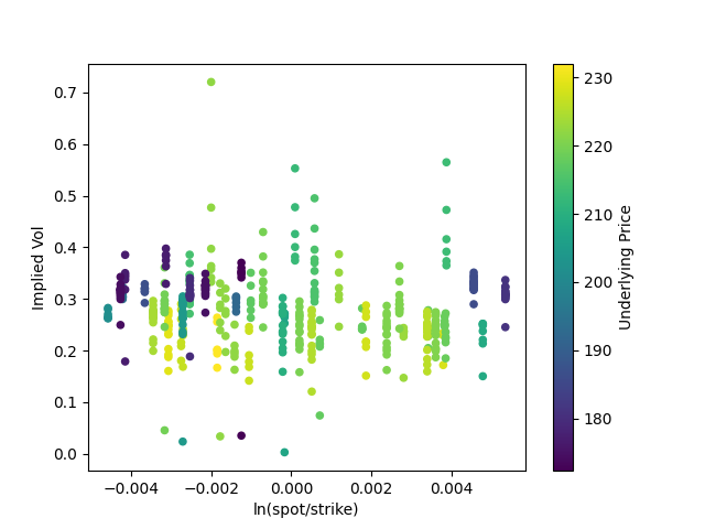
Implied volatility seems to cluster between 0.2 and 0.4; but I'm more interested in how tight the spread is. Even across three months and sizable changes in the price of the underlying, for a relatively illiquid asset class (compared to something like equities or T-bills), implied volatility seems to stay within roughly the same range.
Would would this look like across different markets, such as the vol crash across 2019, or the spike in March 2020? (Give me $50 for another dataset, and I'll find out.)
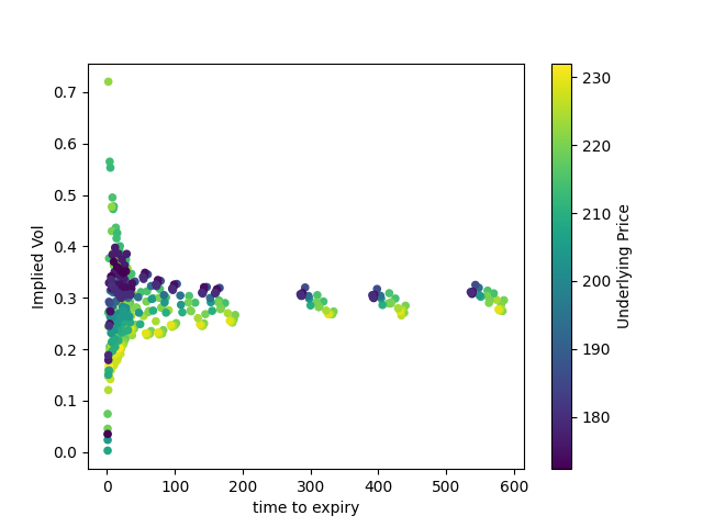
Here, we can see some of the gaps in the dataset. There are clusters of options expiring in ~0-200 days, in ~300 days, in ~400 days, and in ~600 days, but no data for expirations in-between.
The graph itself shows a clear trend: implied volatility is flat for most expiries, but gets wider as time to expiry approaches zero. Why?
Now let's take a look at more of the dataset.
Here are roughly 25,000 observations with a much wider mix of strikes and moneyness:
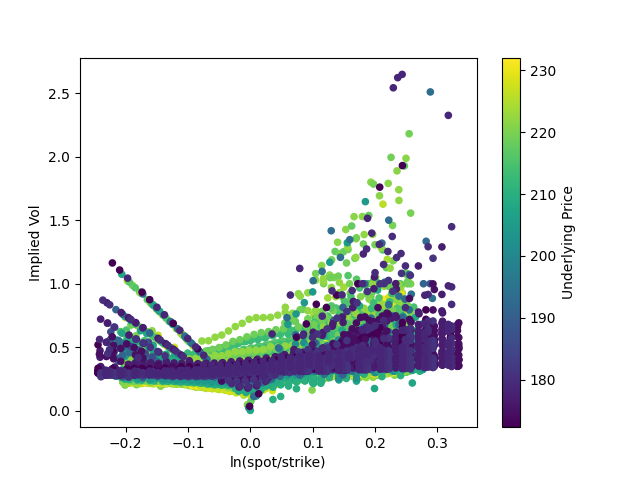
A bit messy, but we can figure out what's happening. In general, implied volatility is flat-ish, but it goes up at the tails and dips as the option becomes at-the-money, where spot = strike.
The left and right tails seem imbalanced. The right tail, especially, seems more diffuse than the left tail. Why? And some of the patterns in the left tail seem too perfectly linear to be random. Is this some kind of data/calculation error, or is it noise, or is there an explanation?
This looks pretty similar to the previous graph of implied volatility versus time to expiry, with the graph pretty flat except as time approaches zero, except that the tails of implied volatility grow longer as we include more deep in/out of the money calls.
Finally, here's a volatility surface:
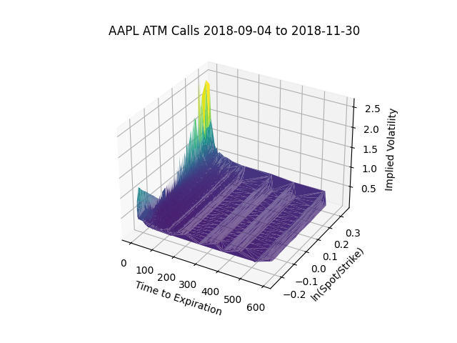
It almost looks like a piece of paper with two corners folded up.